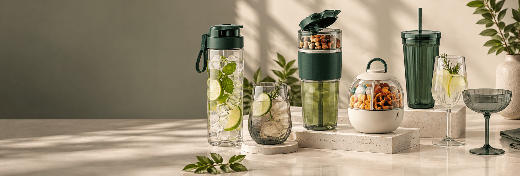
Product formats, colors and presentation should be selected around the customer, sales channel and intended use.
A useful trend is more than a fashionable color. The strongest product direction connects how the item will be used, displayed, packed and reordered. Start with the audience and sales channel, then confirm the shape, material, decoration and packaging.
The best starting point is not “What is trending?” It is a clear brief covering the customer, sales channel, intended use, target price and launch date. Those decisions make trend references commercially useful and prevent a fashionable idea from becoming an impractical product.
1. Everyday Utility
In 2026, the most useful product direction is not novelty for its own sake. Buyers are looking for drinkware and food containers that feel distinctive at first glance but still make sense in everyday use. A cup can have a sculpted silhouette, an unusual lid or a bold color combination, but customers should still understand how to hold it, open it, clean it and store it without needing a long explanation.
This matters because a promotional item, retail product or venue souvenir has to survive beyond the first photo. If the closure is awkward, the container is too wide for common cup holders, or the decorative elements make cleaning difficult, the product can lose repeat-use value. A practical design gives the brand more visibility because it stays in circulation rather than being discarded after one event.
Begin by defining the primary moment of use. A commuter tumbler needs a secure lid, comfortable grip and manageable footprint. A cinema snack cup may prioritize a large opening and easy one-handed carrying. A bakery campaign container may need a shape that photographs well while keeping the food visible. A resort cup may need a stable base and a lightweight, shatter-resistant construction. These are different design problems even if all four products are described broadly as reusable drinkware.
The most reliable way to add character is to select one or two strong details. That could be a recognizable lid profile, a molded handle, a coordinated cup-and-snack format, a tactile sleeve or a custom color system. When every surface competes for attention, the result can look busy and cost more to manufacture. A restrained design is usually easier to approve, decorate, package and reorder.
2. Compact Formats
Compact formats continue to be useful across events, gifting, foodservice and retail because they are easier to distribute, display and combine into sets. Smaller cups, candy containers and portioned snack boxes can work as counter displays, checkout add-ons, welcome gifts or limited-edition merchandise. They also give buyers more flexibility when testing a new shape or theme without committing the entire range to one large item.
Compact does not simply mean making an existing product smaller. Capacity, opening size, wall thickness and closure proportions need to be reconsidered together. A miniature tumbler with an oversized lid can feel top-heavy. A snack container with a narrow opening may look attractive but be frustrating to fill and clean. A short cup with a very wide base may consume more shelf and carton space than a taller product with the same capacity.
For a coordinated collection, choose a small number of repeatable design elements. The same lid language, edge radius, handle shape or color family can connect several products without requiring every item to share the same mold. This helps a distributor present a coherent line, allows a restaurant or attraction to maintain one visual identity, and gives a brand more options for bundles.
Packaging footprint should be checked while the product dimensions are still flexible. A few millimeters can change how many units fit in a retail carton or export case. Nestable or stackable formats may reduce storage volume, but only if the surfaces do not lock together or become scratched during handling. A physical stacking test is more useful than relying only on a rendering.
3. Material Planning
Material selection should follow the intended use, not the other way around. A product may need clarity, flexibility, heat resistance, impact resistance or a specific surface appearance, but no single plastic provides every benefit at the same cost. The first discussion should cover what goes into the item, how hot or cold the contents will be, whether the product is reused, how it is cleaned and where it will be sold.
Polypropylene is commonly considered for practical food containers, lids and components that benefit from lower weight and some flexibility. Clear copolyester materials can suit premium drinkware where glass-like appearance and impact resistance are important. AS or similar rigid transparent plastics may suit cold-drink products and decorative double-wall formats when the cleaning instructions are clearly defined. Silicone may be used for seals, grips, valves or selected flexible components rather than the entire product.
Appearance is only one part of the decision. Transparent materials can show scratches, flow marks and internal stress more easily than opaque plastics. Soft-touch or matte-looking surfaces may hide minor marks but can change the way printed decoration adheres. Dark pigments can make dust more visible. Light colors may show staining sooner in products intended for coffee, tea, sauces or strongly colored foods.
Food-contact documentation must match the actual product, material and destination market. A general certificate for a factory or unrelated product does not replace product-specific evidence. The buyer should define the target country before confirming claims on packaging. Test scope may vary according to the material, type of food contact, temperature, repeated-use claim and local requirements.
Cleaning instructions also need to be realistic. If the selected material or decoration is intended for hand washing, the packaging and product page should not imply unrestricted dishwasher use. If a hot-drink claim is required, the product construction, lid design and user-contact surfaces need to be reviewed together. Clear instructions protect the customer experience and reduce avoidable complaints.
4. Color & Decoration
Color remains one of the fastest ways to make an existing product feel specific to a brand or campaign. The practical trend is moving away from selecting isolated colors and toward building a controlled palette: one main brand color, one neutral and one or two accents. This makes it easier to create coordinated sets and gives the buyer room to release seasonal variations without redesigning the product.
Color approval should be based on the final material and surface texture. The same Pantone reference can look different on transparent, translucent, glossy and matte plastics. Wall thickness can also influence apparent color. A thin lid and a thick cup body made from the same colored resin may not look identical. For projects where color matching is important, approve physical color chips or molded samples under consistent lighting.
Decoration methods should be selected according to the artwork and expected use. A simple one-color logo may work well with screen printing. A wraparound graphic, gradient or detailed illustration may require a different process. Molded or embossed branding can provide a permanent mark without adding printed ink, but it affects tooling and cannot be changed as easily for future campaigns.
Ask where the logo will be seen when the product is held, placed on a shelf or photographed. A large logo positioned without considering the handle, seam or lid can become partly hidden. Decoration should also avoid high-wear grip areas unless the selected process has been tested for that use. The best-looking digital mockup is not automatically the most durable production layout.
Before production, approve artwork size, position, color, orientation and acceptable registration tolerance. For multi-part products, confirm whether the graphics must align after assembly. A signed decoration sample or clear approval record gives both sides a reference when reviewing production.
5. Retail Packaging
Packaging should be developed alongside the product rather than after sampling. The pack has several jobs: protect the item, communicate the offer, fit the sales channel and move efficiently through export delivery. Leaving packaging until the product is finished can lead to oversized cartons, weak internal support or artwork that does not match the final dimensions.
Start with the selling environment. A product displayed in a physical store may need a clear product image, visible color information, a barcode area and a shape that stands securely on a shelf. An online product may place more emphasis on transport protection, compact dimensions and a clear unboxing sequence. A hospitality project may use simple bulk packing because units are distributed internally rather than sold individually.
The internal structure matters as much as the printed box. Lids, straws, handles and accessories should not move freely during transit. Clear products need protection from rubbing. Printed surfaces should not sit against abrasive inserts. If the set includes several shapes, the insert should guide the customer through the contents instead of making repacking difficult.
Packaging copy should be finalized after the material and test scope are confirmed. Avoid adding claims simply because they appear on competitor packaging. Food-contact statements, cleaning instructions, age guidance, warning text and sustainability language should be supported by the actual product specification and destination-market requirements.
Run a packed-product review, not only a flat artwork review. Check the assembled box, opening experience, barcode scan area, shipping marks and master-carton arrangement. For products sold through Amazon or other fulfillment systems, dimensional weight can affect the economics of the entire project. A slightly smaller pack may matter more than an additional decorative panel.
6. Channel Fit
The same product idea should not be presented in exactly the same way to every sales channel. A DTC brand, an importer, a restaurant chain and a theme park may all buy custom drinkware, but the commercial priorities are different. The product direction becomes clearer when the channel is decided before the design is finalized.
For DTC and online retail, the product needs a clear story in photographs and a package that can reach the customer in good condition. A visually recognizable detail is helpful, but it should be easy to explain in a title, product image or short video. Variants should be controlled so the seller can manage inventory without creating too many slow-moving combinations.
For importers and distributors, range consistency and repeat supply are usually more important than a one-time novelty. Related products should share a logical price ladder, carton plan and visual system. The importer also needs reliable product information, test documents and packing data for downstream customers.
For restaurants, cafés and hotel projects, durability, cleaning instructions and replacement planning matter. The design should fit the service workflow and storage space. A dramatic shape that slows washing or takes up excessive back-of-house space may be less valuable than a simple product with strong branding and reliable reordering.
For attractions, festivals and event operators, the launch date is fixed and the product may serve both as a beverage container and a souvenir. Theme, portability and visitor safety become central. Packaging can vary between bulk service units and individually packed merchandise. The approval schedule should leave enough time for artwork, samples and production before the event date.
7. Sampling & Approval
A sample should answer specific questions. It is not only a small version of the eventual order. The review should cover dimensions, capacity, fit, closure feel, color, decoration, surface finish, packaging and the intended use. When feedback is limited to “looks good,” important details can remain unresolved until production.
For customization based on an existing product, the first sample may confirm the selected item and available decoration area. A second sample may be needed for the actual logo, color or package. For a new mold, early prototypes can help review proportion and handling before steel is cut, while trial samples from the production mold confirm the final construction.
Keep feedback consolidated. Conflicting comments from brand, purchasing and packaging teams can delay the project and create unclear responsibility. One approval document should list every required change, supported by annotated photographs or drawings. When a point is accepted, record it so the same discussion does not reopen later.
Review the sample in the real context whenever possible. Place the cup in the intended holder, test the container with representative food, assemble the retail pack and check how the product appears in photographs. If a restaurant or hotel will use the item, a pilot at one location can reveal handling issues that are not obvious in an office review.
Naike Gifts uses a typical starting point of 3–7 days for samples, depending on the product, decoration and available components. A new mold generally requires more planning; the standard website reference is 7–15 days for tooling, subject to structure and approval scope. These are planning ranges, not a substitute for a project-specific schedule.
8. Commercial Planning
A commercially successful product balances design ambition with order quantity, target cost and launch timing. The correct question is not only “Can this be made?” but also “Can it be made consistently at the quantity and price required for this channel?” An attractive concept may need simplification if it introduces several molds, manual assembly steps or expensive packaging components.
The minimum order quantity across product pages is set from 500 pieces as a general starting point. Actual availability can depend on the existing mold, resin color, decoration process and packaging. A stock-color product with a simple logo may be easier to arrange at the minimum than a custom resin color, multi-color print and unique gift box.
Ask for a cost breakdown by decision rather than only one final unit price. The buyer should understand how material, decoration, accessories, packaging and tooling affect the quotation. This makes it easier to decide which feature creates customer value and which feature can be simplified without weakening the product.
Plan the approval date backward from the required delivery date. Include time for sample review, revisions, testing, production, inspection, export preparation and transport. Seasonal campaigns should include a buffer because a late product can lose most of its commercial value even if the quality is acceptable.
Repeat orders should be considered during the first order. Confirm how approved colors, artwork, packaging files and production references will be recorded. If a project uses a custom mold, clarify ownership, maintenance and storage expectations. Consistent documentation makes future reorders faster and reduces variation between batches.
9. Product Shortlist
Formats Worth Reviewing in 2026
- Reusable drinkware with a distinctive but easy-to-use closure
- Shaped candy or snack containers for bakery and food campaigns
- Food-and-drink combinations with practical carrying formats
- Themed plastic cups with retail-ready packaging
- Coordinated product sets built around one sales channel or campaign
Recognizable closure systems. A lid, straw or handle can become the identifying detail of a product family. The opportunity is strongest when the detail also improves carrying, drinking or cleaning. Avoid mechanisms that require several loose parts unless the use case clearly justifies them.
Drink-and-snack combinations. Products that organize a beverage and a small food portion can suit cinemas, attractions, festivals and family outings. Balance is critical: the combined product should remain comfortable to hold when both compartments are filled. The parts should also be separable enough for cleaning and packing.
Compact themed containers. Molded shapes can create strong recognition for licensed themes, seasonal campaigns and bakery promotions. Before developing a custom shape, check opening size, filling method, decoration area and how the product sits in a carton. A memorable front view should not create an unstable base or a difficult mold release.
Coordinated retail sets. A cup paired with a snack container, accessory or matching package can raise perceived value without requiring every component to be newly tooled. The set works best when the pieces share a clear purpose and visual language rather than being grouped only to increase item count.
Reusable event products. Venues and campaigns are looking for alternatives to generic single-use serviceware. A reusable cup can become part of the visitor experience, but the collection, cleaning or take-home model needs to be defined. The product should communicate whether it is a service item, deposit cup or souvenir.
Neutral bases with seasonal accents. A stable core product in a neutral or brand color can be refreshed through lids, sleeves, printed graphics or packaging. This reduces the need to redevelop the entire item for each campaign and can make repeat purchasing more manageable.
10. Build a Useful Buyer Brief
A strong inquiry does not need a complete engineering drawing. It needs enough commercial context for the supplier to recommend a realistic starting point. Include the product type, intended user, sales channel, destination country, estimated quantity, target launch date and any non-negotiable brand requirements.
Reference images are useful when they explain a feature, but clarify what should be copied conceptually and what must remain original. One image may show the desired lid, another the color mood and another the packaging style. Without explanation, the supplier may focus on the wrong detail.
State whether the priority is speed, minimum order quantity, target price, unique shape or premium presentation. Most projects involve trade-offs. If every element is described as the highest priority, the proposal may become unnecessarily complex. A clear ranking helps the development team present better options.
For an existing-product route, ask for available dimensions, materials, colors, decoration areas and packaging choices. For a custom-mold route, share sketches, reference samples or 3D files when available and identify which dimensions are fixed. In both cases, confirm what needs to be included in the quotation so comparisons are meaningful.
Frequently Asked Questions
Should a trend reference determine the final material?
No. Visual references can guide color, shape and presentation, but material selection should follow temperature, food contact, durability, cleaning and destination-market requirements.
Is an existing product or a new mold the better starting point?
An existing product is usually more suitable when speed, lower development risk or a smaller opening order is the priority. A new mold makes sense when the shape, function or protected brand identity cannot be achieved with available products.
How early should packaging be discussed?
Packaging should be discussed during sampling. Product dimensions, accessory layout, barcode area, instructions and transport protection affect the pack structure and project cost.
What information is needed for an initial quotation?
Company name, business email, product or reference image, estimated quantity, destination country and required delivery date are enough for an initial review. More detailed artwork and specifications can follow.
How can sample-to-production differences be reduced?
Approve a clearly identified final sample, color reference, artwork position, packaging structure and written specification before production. Keep all requested changes in one approval record.
Material Sustainability Misconceptions Debunked
❌ Myth 1: "'Bio-Plastic' Always Means a Product Degrades Naturally in Backyard Soil"
✔ Engineering Reality: Most commercial bioplastics (such as PLA) only decompose under industrial composting conditions (58°C heat, controlled humidity, commercial microbes). In natural landfills or oceans, PLA behaves similarly to conventional plastics. Certified post-consumer recycled (PCR/rPET) resins often provide a more practical circular economy footprint.
❌ Myth 2: "Natural Plant Fibers (Wheat Straw / Bamboo) Do Not Require Any Polymeric Resins"
✔ Engineering Reality: Pure plant fibers cannot be injection molded into waterproof, food-safe drinkware without a polymer matrix. Legitimate eco-composites combine 20%–40% agricultural plant fiber with 60%–80% food-grade PP. Buyers must ensure suppliers provide full FDA/LFGB resin traceability.
❌ Myth 3: "Recycled Plastics (PCR) Cannot Achieve Clean, Premium Retail Finishes"
✔ Engineering Reality: With modern optical pellet sorting and advanced masterbatch color compounding, GRS-certified PCR resins achieve >95% of virgin resin color consistency and impact durability, allowing premium retail branding with an eco-certified story.
Planning a New Product Range?
Share the product idea, quantity, destination market and delivery date for a focused project review.